This post is to showcase and briefly discuss a re-design project I have been working on for a watch company I do a lot of work for. This is a re-work of a watch design I had previously written about in a blog post that can be found here: https://jayargonaut.com/2024/05/31/a-watch-design-a-tribute-to-the-white-cliffs-of-dover-an-island-the-albion/.
Before I get into this post I also want to let my good readers, and voters, know of the results of my last blog post: https://jayargonaut.com/2024/10/13/watch-design-poll-symmetry-vs-asymmetry-which-design-do-you-prefer/. The 6 o’clock version for the date window has won the day, with approximately 60% of the voters preferring the date window at the 6 o’clock position. Thank you to all the readers that took part👍.
Now back to my main content for this blog, a watch design that has just been launched to the watch market, and this week is being first previewed at a watch show in Manchester UK: https://www.thewatchcollectorsclub.com/the-manchester-watch-show/.
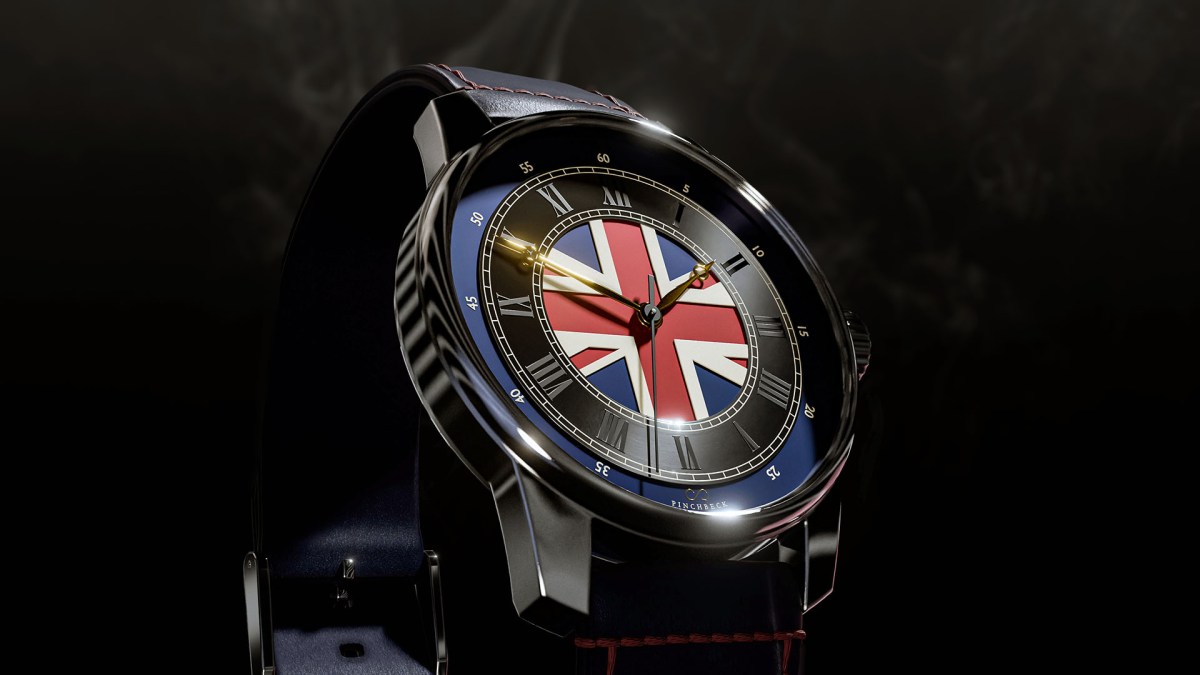
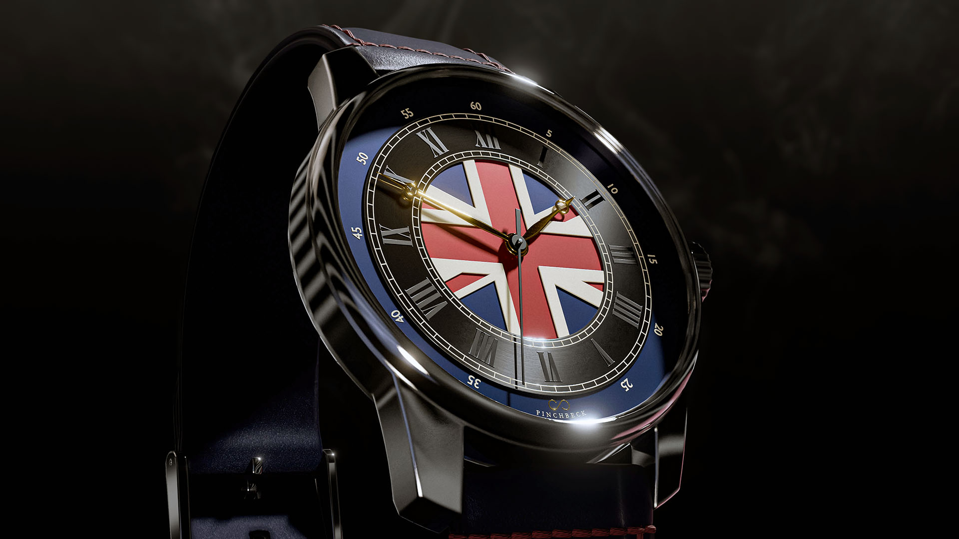
The ALBION Watch
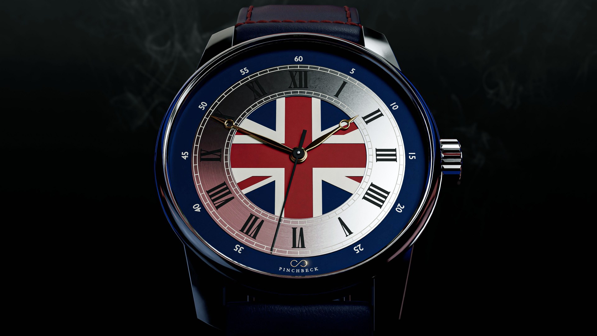
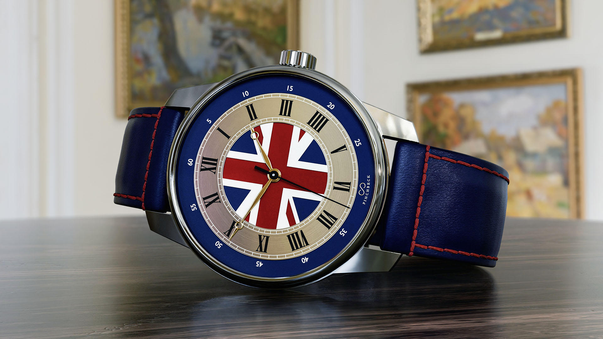
The above is the final design for this model of the Albion watch launching now. The base design is the same as the previous one and is a variant of a standard machined watch dial I designed some time ago; it forms the base for the Soldiers Charity watch series: The Waterloo and The Trafalgar.
The main difference is in design detail, and of course the colour scheme. The decision was to go with a colour scheme much bolder and traditional of the Union Jack flag of the United Kingdom, which features striking red, white, and blue elements that symbolize the rich history and heritage of the nation. This choice not only enhances visual appeal but also evokes a sense of recognition. By incorporating these vibrant colors, the design captures the essence of British culture and identity, making it instantly recognizable and memorable. Moreover, the balance and arrangement of the colors reflect a harmonious blend of modern aesthetics with classic motifs, inviting viewers to connect with the timeless legacy of the flag while appreciating the contemporary touch added to the overall design.
This design is quite bold and striking, which of course often polarizes opinion because of personal taste. Personally, I like bold and striking design like this; of course, as I designed it, I would have that bias. It allows for a dynamic conversation surrounding aesthetics and functionality, bringing forth a variety of perspectives that challenge conventional norms. But as a good friend of mine told me one day, the opposite of love is not hate, but indifference. This notion resonates deeply within the creative community, as we often find ourselves yearning for engagement, dialogue, and emotional responses to our work. Basically, that means we want people to notice us and our designs, to evoke feelings that inspire them to reflect, question, and ultimately appreciate the artistry behind the choices made.
A ‘proud and epic’ feel for the Header image:
So what do you think? Do you like the vibrant boldness of this design, or do you prefer more subtle decoration? The striking colors and daring patterns of a bold design can draw attention and evoke strong emotions, providing an energetic atmosphere. On the other hand, subtle decoration often creates a sense of calm and tranquility, allowing the viewer to appreciate the finer details without being overwhelmed. Of course, neither is actually correct; it is all just subjective opinion, but it’s good to voice and hear nonetheless, as discussing design preferences can lead to a richer understanding of how different styles resonate with individuals.
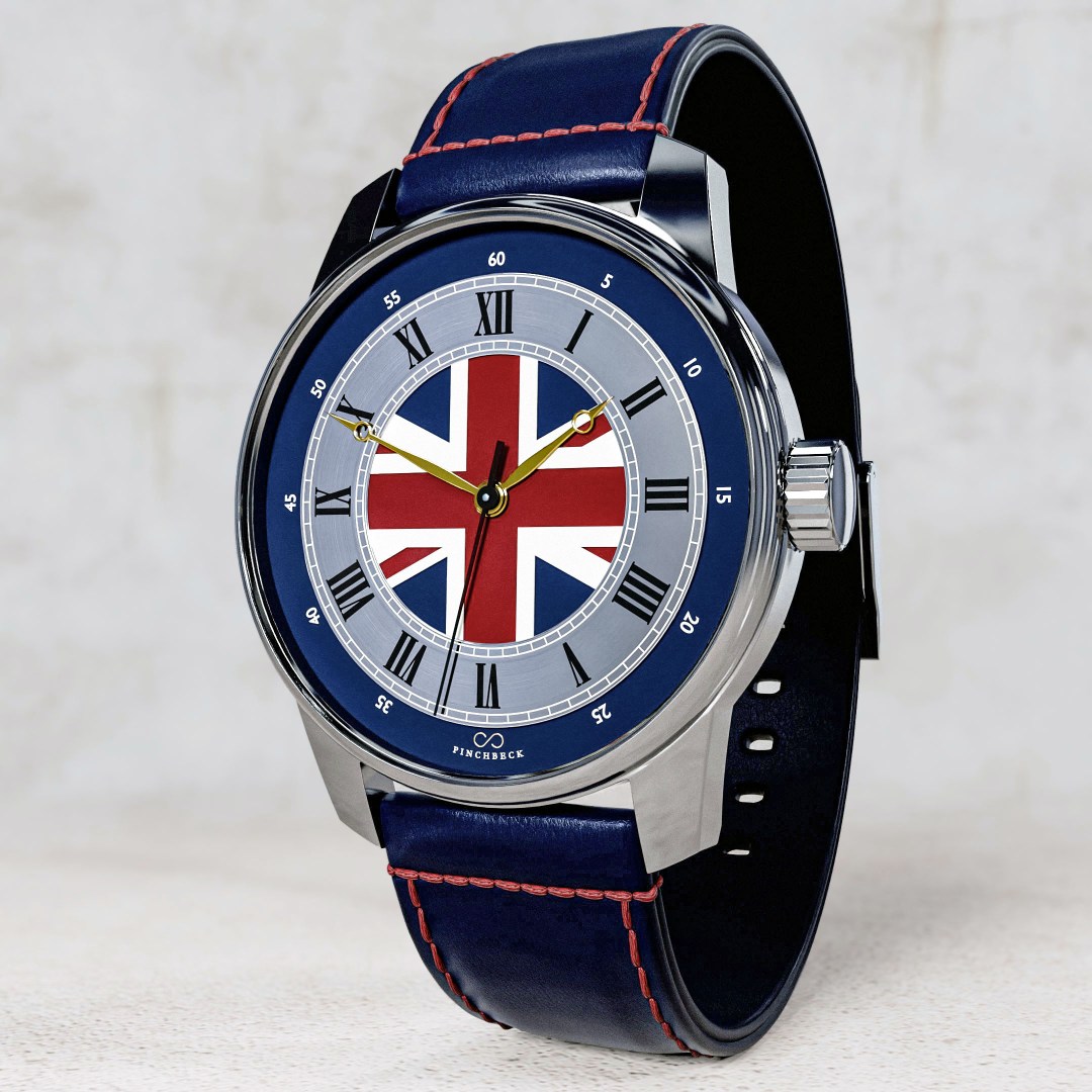
The core of the design is, of course, the United Kingdom Union Flag, which is a wonderful piece of design work in its own right, reflecting the rich cultural heritage and historical significance of the nation. The Union Jack flag has quite a rich history, of course, and was originally designed by the Earl of Nottingham, I believe, to symbolize the unity of England, Scotland, and later Ireland. Its intricate pattern of crosses represents the individual nations that make up the United Kingdom, showcasing a blend of traditions that have evolved over centuries. Each element of the flag tells a story, with the cross of St George representing England, the saltire of St Andrew symbolizing Scotland, and the cross of St Patrick honoring Ireland. This combination not only serves as a visual representation of national unity but also reflects the complex interplay of cultural influences that have shaped British identity. Over the years, the Union Flag has been adopted in various contexts, including state occasions, sporting events, and cultural celebrations, reinforcing its status as a source of pride for many citizens. Its design has inspired countless variations and adaptations, demonstrating its enduring appeal and significance in both national and international settings.
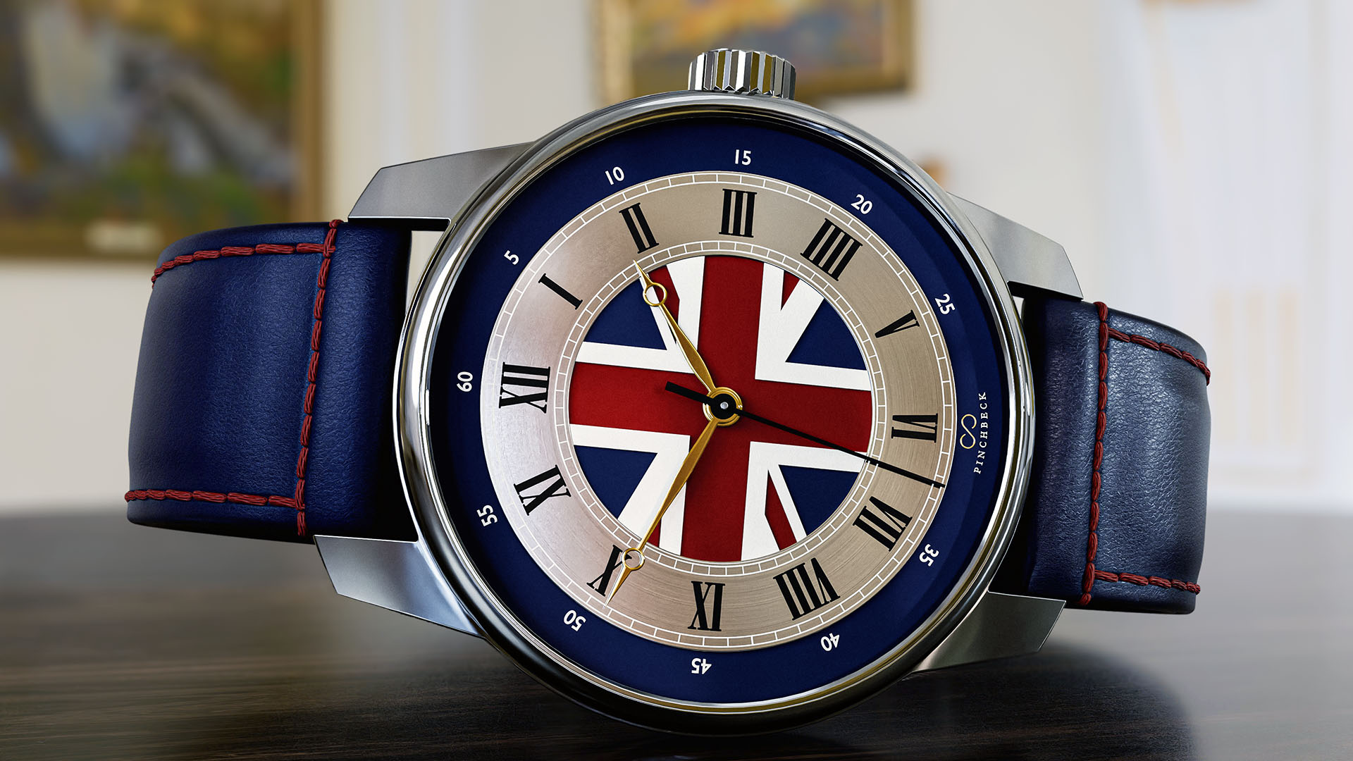
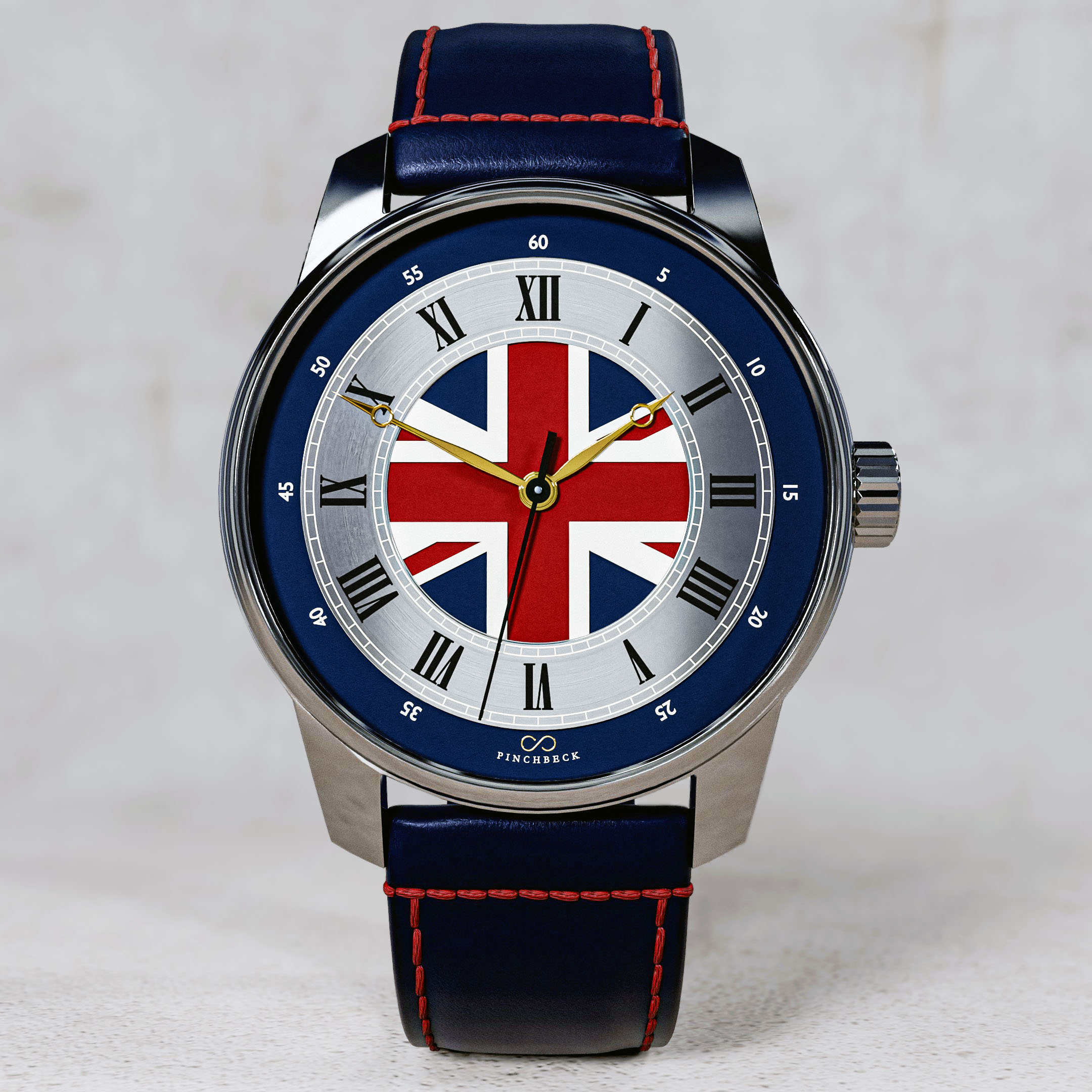
The watch design is all my own work, apart from the Union Jack original core design of course… I cannot take credit for that, this is my homage to that great design! I designed and mesh modelled the full watch in Blender 4.2.
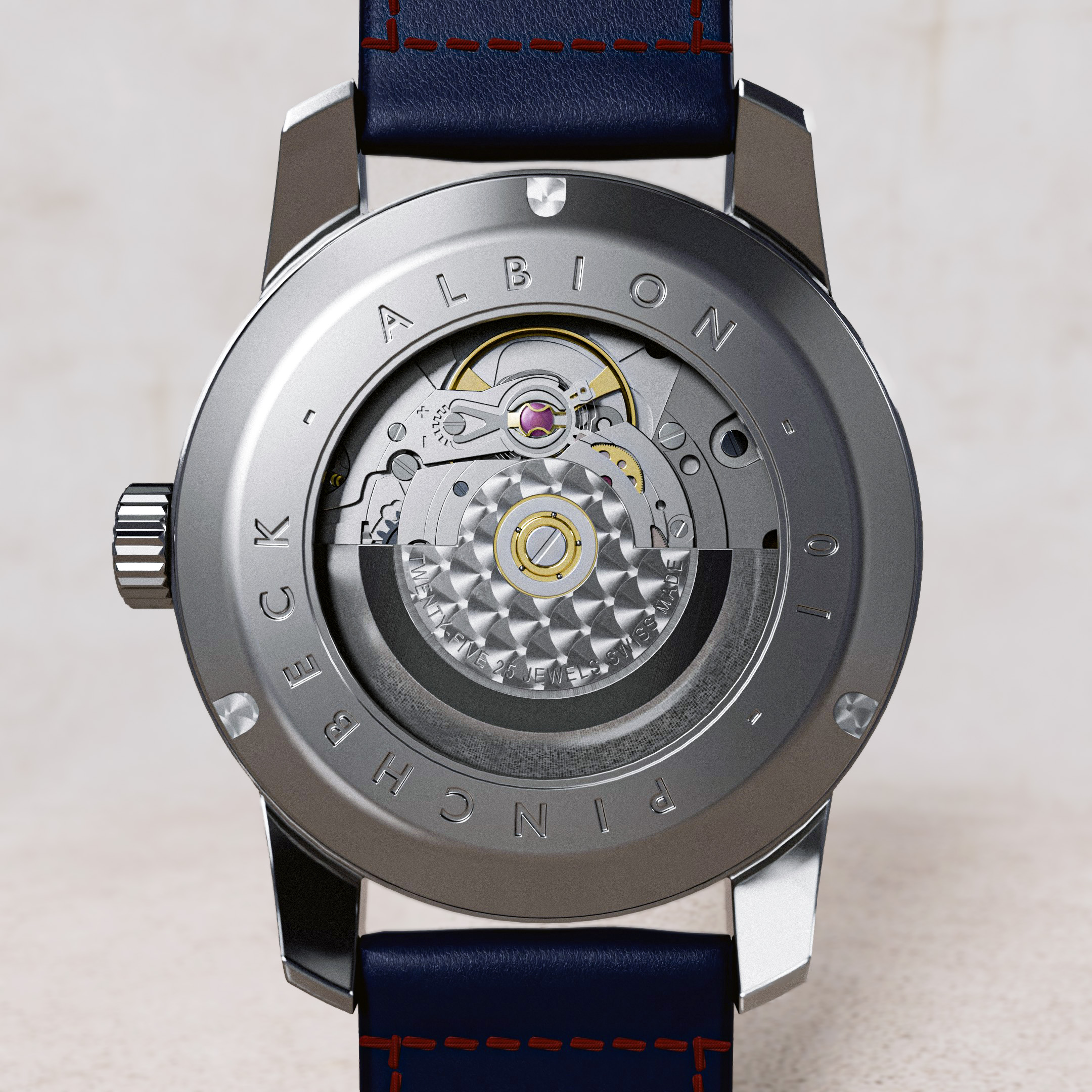
All renders you see above were rendered using Blender 4.2, with all post-render finishing and touching work made using Adobe Photoshop.
For the header image I wanted to create a bit of an ‘epic’ feel to the image, so some carefully placed coloured lighting created the blossomed reflections, and an appropriate HDRI image picked up the edges and reflections of the watch case edges. The result is quite successful I think.
Well that is is for this post. I hope you like the design and my renders. And thank you for stopping by my blog😊.
Have a great day everyone!
Kind regards, Jay
Discover more from Jayargonaut - Watch Designer
Subscribe to get the latest posts sent to your email.

Stunning time piece! I love the bold design…showcase it, let it be seen. Being a British girl myself, what can I say…I love it! 😍
LikeLiked by 4 people
Thank you Sara for that wonderful compliment and super positive support, I sincerely appreciate it👍. It is being promoted for the first time at the Watch Show in Manchester this week, hopefully more after. Thanks again & kind regards…Jay😊
LikeLiked by 4 people
My pleasure, Jay. I hope all goes well in Manchester 🤗
LikeLiked by 3 people
Thank you Sara😊. I appreciate it👍
LikeLiked by 3 people
What an incredibly gorgeous piece, Jay! I love the blue band with red stitching. So classy.
LikeLiked by 4 people
Thank you Lauren for that wonderful compliment and support, I sincerely appreciate it. Glad you like the strap, adds a nice touch doesn’t it. Kind regards…Jay😊
LikeLiked by 4 people
I like it, with one minor quibble . . . I think the hands are overwhelmed by the bold design. Perhaps the actual piece offers better differentiation of the hands relative to the background. There’s also less differentiation between the minute and hour hands than I generally prefer, but I presume most people would know and differentiate between the time being 10:10 or 2:50.
Other than that (personal and minor) quibble, very nice rendering and design.
Side note: should the first word be “This” and not “To”? Perhaps it’s a British thing, but it reads wrong to me.
LikeLiked by 4 people
Thank you Emilio, I am glad you like it. The hand size and design specification were chosen by the commissioning company, so some things were beyond my design grasp, but I think you are right, it should work at ‘actual size’. The Company tend to make very classically English style dress watches, so it suits that style. If it were all under my control, I tend to agree with you, I would have gone for something more contemporary and bolder with more contrast.
Thank you for pointing that error out👍. No, it wasn’t a British thing, just a typo😊. I appreciate it Emilio. Kind regards, Jay
LikeLiked by 4 people
I love the vibrant colors and it looks so classy!
LikeLiked by 4 people
Thank you Rojie😊. I am glad you enjoy it, and I appreciate your compliment. Kind regards, Jay.
LikeLiked by 3 people
Outstanding design! I like the bold colours!
(I also really like the White Cliffs of Dover design. It would be impossible for me to choose. 🙂 )
LikeLiked by 4 people
Thank you Morgaine😊. I sincerely appreciate your kind words. Glad you like them both! I do too to be honest. They both have slightly different moods don’t they. I am hoping they bring that one out too. Kind regards, Jay.
LikeLiked by 4 people
I love the bold and bright design. Frankly, if you’re going to spend good money on a unique watch, it should look unique and spectacular. You’ve managed to accomplish both with this design. Well done, my friend.
LikeLiked by 4 people
Thank you Dayle for your wonderful support and compliment, I sincerely appreciate it! I am glad you enjoy the watch and the design. And I agree with your comment on being spectacular, thank you…and what a great word! Thank you my friend and kind regards, Jay😊
LikeLiked by 3 people
Simple yet bold, quite a cool design!
LikeLiked by 4 people
Thank you Ajinkya! I am glad you like it. Kind regards…Jay😊
LikeLiked by 3 people
Wow! Stunning and gorgeous design!
LikeLiked by 4 people
Thank you for that great compliment Daisy😊. I appreciate your support, and I am glad you like the watch! Kind regards…Jay😊
LikeLiked by 3 people
What an elegant timepiece! It’s beautiful!
LikeLiked by 3 people
Thank you for that compliment Kymber, I sincerely appreciate it😊. I am glad you like the design! Kind regards…Jay
LikeLiked by 3 people
Absolutely stunning piece of art!
LikeLiked by 3 people
Thank you Robin for that wonderful compliment. I sincerely appreciate it, and pleased you like it. Kind regards…Jay😊.
LikeLiked by 2 people
Wow! It’s fantastic what you can do with the renders.
I like the bold. I like the subtle. Both designs make a statement. For me, it would depend on the outfit I’m wearing. I do like wearing a man’s watch.
I wear black a lot. An all black outfit with the colourful watch would be gorgeous.
A cluster of long silver chains, pearl ropes and lapis beads à la Chanel draped around the neck, with red shoes and bag, finish the outfit.
What a great ad that would make for this stunning watch!
I adore the Union Jack. It is the most handsome of all flags in the world
Thank you, Jay!
LikeLiked by 3 people
Thank you Resa😊. I am glad you appreciate and enjoy the design, both of them.
Black sounds a great contrasting platform for this watch, I must admit I do like black as a backdrop, as you can maybe tell.
It certainly appears you know what you are doing, and enjoy, collating colours and jewellry to a successful finale. Maybe we could create that ad one day!
This has only just launched, and not sure how it will be received in this currently sensitive world. But I would like it to be a mainstay base design – Like you, I think the Union Jack in a wonderful piece of great and classic design!
Thank you Resa for your great and comprehensive comments. Kind regards, Jay
LikeLiked by 3 people
Jay,
Maybe we could!
I was a stylist and costume designer for many years. I am dedicated to all of the arts. They seem to be where I feel life makes some sense.
It is an over sensitive world. You have kind words for a cruel world.
Best to you! 🕊🤍
LikeLiked by 3 people
Thank you Resa. Yes, I have seen your work, you certainly know your trade.
The arts seem to be our way of trying to understand the world don’t they…maybe.
Best to you too Resa, have a great one😊!
LikeLiked by 3 people
Cheers! 🌹🌟
LikeLiked by 3 people
Love it! I can almost hear “Rule, Britannia” playing or see 007 chasing some spy in his Aston Martin 😎 Seriously, Jay, kudos on a beautiful design 👍👏
LikeLiked by 3 people
Thank you Darryl for that wonderful compliment😊, I sincerely appreciate it👍. Yes, I know what you mean, makes me think of Bond in his old Aston Martin DB5 for sure…and of course, for some reason, the British Mod subculture. Not that I am a Mod, but they love their Union Jack & wear it with such clean style. While searching I stumbled on this guys wonderful blog, Rod the Mod…brilliant, take a look:
Kind regards, Jay👍
LikeLiked by 2 people
Love it! A Union Jack retainer 😂 Thx for the link 😎 🇬🇧
LikeLiked by 2 people
You are welcome Darryl👍. Yes ace isn’t it😄, he has a cool collection!
LikeLiked by 1 person
Love the Union Jack piece!
LikeLiked by 3 people
Thank you Sharon😊. Glad you like it👍. It seems to be attracting lots of attention! Kind regards, Jay.
LikeLiked by 2 people
The Union Jack is one of my favorite designs! I bet Noel Gallagher would wear this on his reunion tour! Chop chop! 😊
LikeLiked by 2 people
Thank you for the great comment😊. Yes, it is a wonderful design the Union Jack isn’t it, so strong and iconic! What a wonderful idea….thank you! Kind regards, Jay👍.
LikeLiked by 2 people
I love this!
LikeLiked by 2 people
Thank you Dawn! I am pleased you like it so much😊. Kind regards…Jay
LikeLiked by 1 person