I have been trying out the differences in the two major new colour management systems in the new Blender 4.2 upgrade, while working on a scene with a new watch design I have been working on. I love the AGX colour management system as it brings a whole new level of realness to my rendered images. Now there is a new colour managment system – Khronos PBR Neutral.
Here are two of my scenes rendered with the two different management systems and the same post-processing:
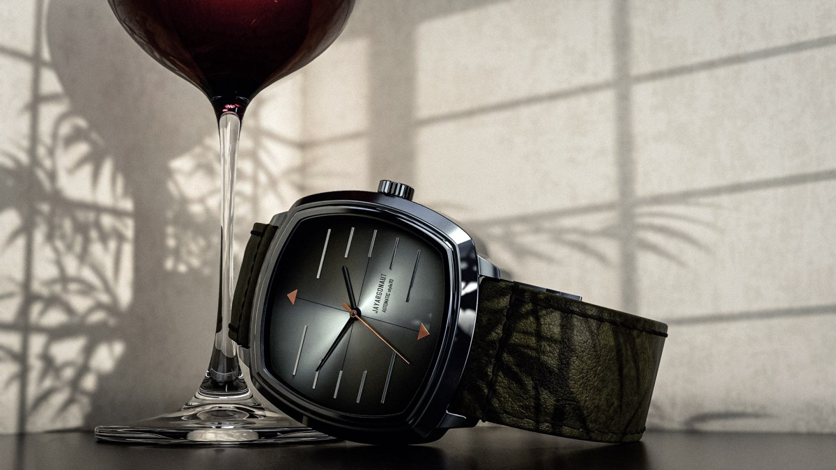
Scene rendered with AGX colour:
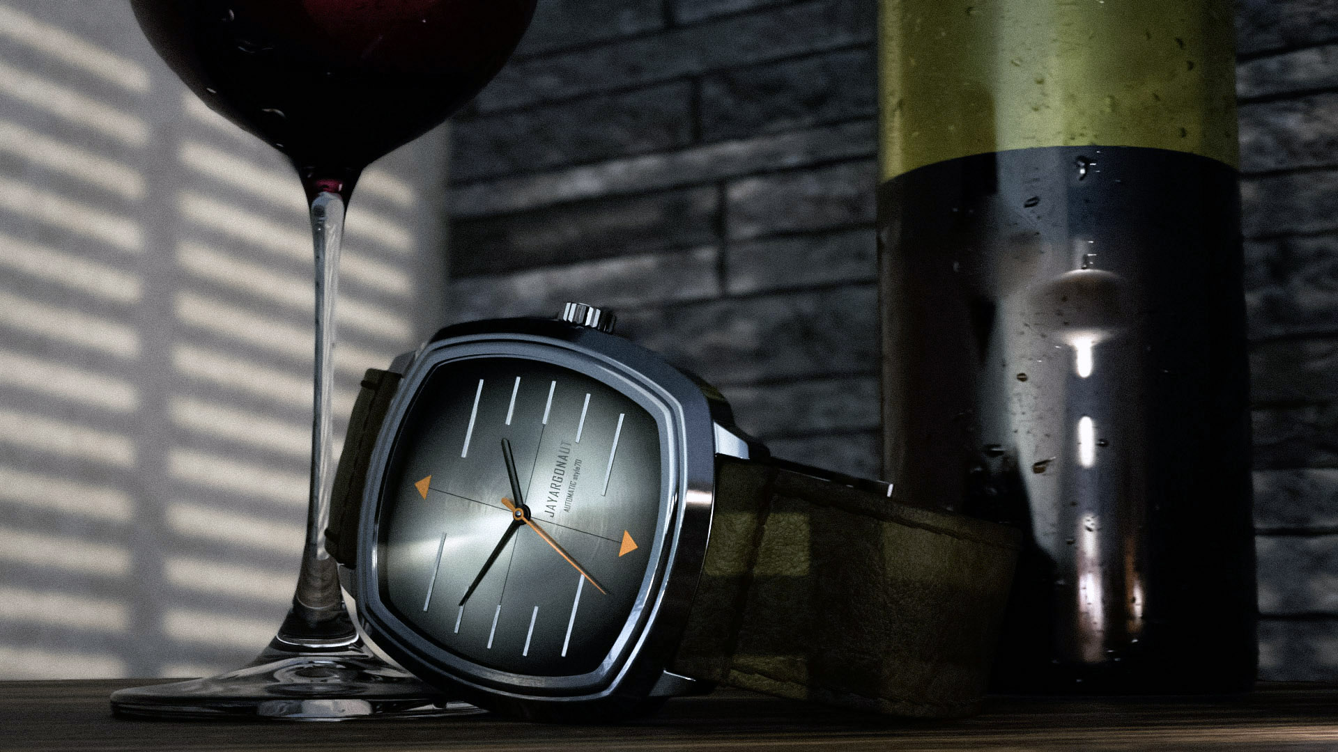
Scene rendered with Khronos colour:
The two images compared – AGX First:
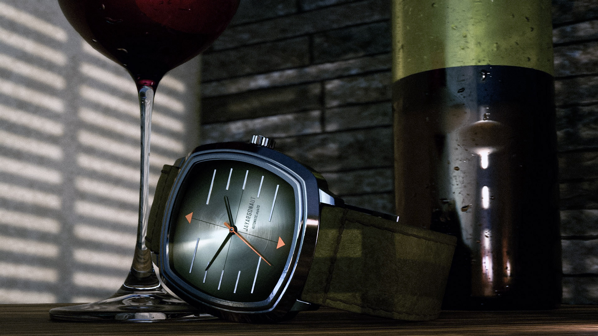
AGX first and no post processing:
Firstly, in the context of Blender 3D creative suite, a colour management system refers to the set of tools and processes used to ensure accurate and consistent colors throughout the workflow, basically it handles how the colours in my image are represented. It includes managing color spaces, display calibration, and handling the transformation of colors across different devices and mediums. A robust color management system in Blender is crucial for achieving high-quality visual results, as it helps me maintain colour fidelity and predictability in my projects. It also plays a significant role in ensuring that the final output looks as intended across various display devices and when rendered for different purposes, such as digital media, print, or video production.
Rendered with AGX colour managment:
The new Khronos PBR neutral colour management system in Blender 4.2 is meant to bring a significant improvement in colour accuracy and consistency. It aims to provide a more standardized and predictable colour output across different devices and platforms, making it easier for artists and designers to maintain the integrity of their work throughout the creative process. On the other hand, the AGX color management system in Blender 4.2 has been known for its versatility and robust features, catering to a wide range of colour grading and manipulation needs. While both systems have their strengths, the Khronos PBR neutral color management system emphasizes strict adherence to industry standards, while the AGX system focuses on providing advanced tools for creative expression and control over the colour workflow.
AGX colour management system in Blender 4.2 is, in my opinion, fantastic👍! It offers a wide range of colour grading and correction tools, which allows for precise and intricate adjustments to enhance the visual appeal of the rendered images, I find I can get a very realistic and, can I say, old-style real photo look with it. The new Khronos PBR neutral color management system in Blender 4.2 focuses on providing a consistent and standardized approach to achieve realistic and accurate colour representation in physically-based rendering. Khronos tends to saturate the colours more, which I know for many people has been the gripe about AGX – that it tends to desaturate some colours too much. Both systems have their strengths and applications, and the choice between them would largely depend on the specific requirements of the project as well as the personal preferences of the user. While AGX offers a more customizable and artistic approach, Khronos PBR provides a more standardized and physically accurate color representation, making it suitable for projects that require adherence to strict color standards and realistic rendering.
In summary it all depends on the result you are looking for, but you can play about with both and also process the colours very well if you have access to Adobe Photoshop…another great tool!
That is it for this post…I hope you enjoyed it😊.
Have a great day & kind regards!
Jay
Discover more from Jayargonaut - Watch Designer
Subscribe to get the latest posts sent to your email.

Look futuristic, amazing job Jay
LikeLiked by 3 people
Thanks Freddie🙏. I am glad you like it😊
LikeLiked by 2 people
You’re welcome Jay
LikeLiked by 2 people
I love the way it looks, Jay! Very cool!
LikeLiked by 2 people
Hi Laura😊. Thank you very much! I am glad you like it! The retro-futuristic style is one of my favourites.
LikeLiked by 2 people
Me too! Where can I buy one? Lol 😆
LikeLiked by 2 people
Its a cool style isn’t it, the 70’s had loads of it! Ah, well, it is a new project I am working on, but might be someway off before it hits the market…I’ll keep you on the informed list Laura😉.
LikeLiked by 2 people
Excellent 👏 👏 can’t wait 😆 thank you!
LikeLiked by 2 people
Loving the rendering and the differentiation between colour management systems. That watch looks very much like an altimeter. Slick and functional.
LikeLiked by 2 people
Thank you Ajinkya! I am glad you enjoyed the post😊. Glad you like the design too, it is one of my personal favourite styles👍.
LikeLiked by 2 people
Its really cool and functional, it doesn’t look like it can be but it is and I can see why you like it so much.
LikeLiked by 2 people
Thank you Ajinkya😊! I am glad you noticed, and I know what you mean. It took me a while to plan-out and rationalize the dial, as it was inspired by something, but by planning the geometry carefully, I think it has balanced out and works well😊.
LikeLiked by 2 people
Amazing
LikeLiked by 2 people
Thank you Vijay🙏. I am glad you like them. kind regards, Jay😊
LikeLiked by 2 people
Very chic!
LikeLiked by 3 people
Thank you Dawn😊. I am glad you like it!…Jay
LikeLiked by 1 person
BUONA GIORNATA
LikeLike